Colour Taboos You Should Avoid For Your House
Here are 10 colour taboos you should avoid in your house in Kuala Lumpur and Selangor:
1. Don’t blue the kitchen and dining area
The food on the blue table or placemat is always more appetising in warm colours. Also do not install blue mood lights which make food look unattractive.
 2. Black and white ratio
If you use black and white in the room, it will make some people nervous, dazzled, and irritated. It is best to use white as the main colour, and use other colours for other minor spaces.
3. Purple a sense of depression
A large area of purple will make the overall tone sad. It is not recommended in a cheerful atmosphere or in a child’s room. It is acceptable to use purple for small spaces.
4. Pink irritating emotions
Some newlyweds like to make their bedroom romantic with pink colours. However, pink has the effect of keeping people in a state of excitement and after a period of time, the people who live in them will become easily irritable and like to squabble. However pink can be used to dilute the concentration of other colours and pale pink walls or wallpaper can make a room appear warmer.
 5. Red is not to be used as the main colour
Too much red in the room overburdens the eyes and causes dizziness. Choose red for soft decoration, such as curtains, bedding, bags, etc., to create a festive atmosphere.
6. Do not decorate the room with a single gold colour
The reflecting golden environment is uncomfortable. It is not recommended to use a single golden colour on a large space but it can be used as a decorative colour on wallpapers and soft curtains. On the bathroom wall, a golden mosaic can be used with cool white or stainless steel.
7. Black avoids large-area application
No one decorates the bedroom wall in black. When used in the bathroom pay attention to the proportion. It is recommended to embellish the appropriate gold in a large area of black, which will be both calm and luxurious. It is a timeless classic with white and when it is matched with red, the atmosphere is intense and hot.
8. Don’t use yellow in the study
Long exposure to high-purity yellow will give people a feeling of laziness, so it is may be used in guest rooms and restaurants. Yellow is not suitable for use in the study, as it will slow down people’s thinking.
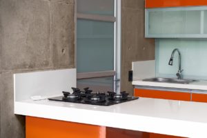 9. Orange affect sleep quality
Orange is not conducive to sleep. Do not use it in bedrooms but in the living room, as it creates a cheerful atmosphere. Orange has an appetite-inducing effect, so it is also the ideal colour for decorating a restaurant.
10. Brown is not the ideal colour for restaurants and children’s rooms
Brown should not be used in children’s rooms and restaurants, the dull colour will make the child’s character depressed.
For more details on how to bring colours into your home, check out our wallpaper installation service and house painting service and speak to our experienced team members today.